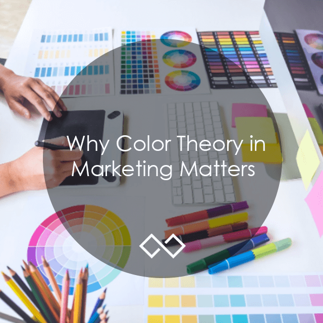
Colors can have a huge impact on how your target audience sees your brand. Understanding color theory can help with your visual marketing.
Fun Fact: “People decide whether or not they like a product in 90 seconds or less. 90% of that decision is based solely on color.”
Crazy, right? In marketing, color theory is so important to understand when choosing colors for your business because it helps communicate the personality, feel and voice of your brand to your target audience.
I was working with a client recently as we were choosing colors for their brand and I remember them saying to me, in the middle of the process, “I know I keep going back and forth, but I feel like this is important for me to get right.”
It is! Having a solid brand pallet can help increase business sales. Merging your preference of color, trends of color and the understanding of the meaning behind colors can be difficult, but understanding color theory can help you make better color decisions for your visual brand.
Understanding Color
When when working with colors, they can be categorized in the following ways:
#1. Mixing Models
Color models help you choose colors in the design process and the model you use depends on what your marketing material is. There are two types of mixing models: CMYK and RGB. RGB is an additive color mixing model and CMYK is a subtractive color mixing model.
RGB is a model that is used for graphics on electronic devices, such as TV screens and computers. You create colors in this model by mixing red, green, and blue light to make variations of color or make colors lighter. If you mix all the colors, you get white. In a CMYK mixing model you subtract colors. When you mix colors in a CMYK model, the colors get darker. These colors are usually used for print materials such as brochures, posters, and flyers.
#2: Color Wheel Basics
The color wheel can help develop cohesive color combinations. The color wheel consists of three primary colors (red, yellow, blue), three secondary colors (that are created when primary colors are mixed: green, orange, purple) and six tertiary colors (colors that are made from primary and secondary colors: blue-green or red-violet).
The color wheel is also split up into two categories: warm colors (reds, oranges, yellows) and cool colors (blues, greens, and purples). Warmer colors are associated with vibrancy and energy while cool colors are associated with peace and calmness. Understanding the color wheel can help make your brand more impactful in communicating your brand message.
#3: Hue, Shade, Tint & Tone
There are also different ways you can work with colors. Hues are the original colors on the color wheel. When you want to add a tint, white is being added to the color (e.g blue + white = light blue). Tints will make your colors lighter. Shades are when black is added (e.g. blue + black = indigo). Shades will make your colors darker. With tones, a tint of grey is added and will make your colors less intense.
WE CREATED THESE WORKSHEETS TO HELP YOU UTILIZE YOUR BLOG AND SOCIAL MEDIA BETTER. DOWNLOAD OUR FREE PRINTABLE SOCIAL MEDIA & BLOGGING WORKSHEETS BELOW:
Color Groupings
Now that we understand some of the basics, we can get to the fun part! I have listed a couple of techniques that will help you come up with a pallet for your business brand. Color grouping can can look like this:
#1: Analogous
These colors are on the color wheel (e.g. blue, purple, and green). In this color scheme, you have a main color, a supporting color, and an accent color. This color pairing can help direct a customer’s attention to certain places in your design, which will move them to act on marketing materials.
#2: Complementary
You are using colors that are on opposite sides of the color wheel in this color grouping (e.g. purple and yellow or green and red). This color pairing can make your brand imagery pop since the color contrast is so different.
#3: Triadic
Triadic colors are colors that are spaced evenly around the color wheel and can give your brand a brighter look. This color scheme helps create visual contrast and harmony at the same time. Every element in your image can stand out and still come together well.
#4: Monochromatic
This is actually one of my favorites! Monochromatic schemes help create a beautiful color harmony. This color scheme only uses one color and you get your variations from shades, tints, and hue variations. A color pallet like this can give your brand a look that has a cohesive flow.
 So, now that you understand color theory, you’re equipped to make better design choices! If you are heading over to update your brand colors, feel free to start fresh with our free downloadable: Laminate-Worthy Brand-Guide Outline!
You can also use Deposit Photos to put together an inspiration board of images to help give direction to your brand’s feel, which will help you make color choices.
If you’re in need of some direction, South Street & Co. can help solidify the look of your brand to better reach your target market. We create logos and style guides to help your company be successful. Set up a 30-minute consultation to learn more about what we can do for you!
Get in touch
Schedule your complimentary call with us today!