A user’s experience when they enter your website is very important. The visual side of website design plays a huge role in engaging your audience. Here are some tips on how to improve your small business website design.

Websites should create a great user experience for the visitor when they enter your site. Statistics show that 38% of people will stop engaging with a website if the content or layout is unattractive. Here are a few pointers to get you started on making a more beautiful small business website design.
Keep it Minimal
I am a minimalist at heart. I believe more is less in design. Much of website design today is taking a minimal approach, and it’s necessary. When someone enters your site, they should not be overwhelmed by the content. You want to keep your visitor on your website as long as possible. Make your website easy for them to navigate and find the information they’re looking for.
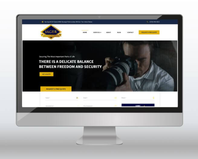
A couple of things you can do to create a more minimal website is put your most important information in the header. Use high-quality images, include a call to action, and utilize your menu. If you need inspiration on websites that keep it minimal, download our freebie to help you start your search.
WE CREATED THESE WORKSHEETS TO HELP YOU UTILIZE YOUR BLOG AND SOCIAL MEDIA BETTER. DOWNLOAD OUR FREE PRINTABLE SOCIAL MEDIA & BLOGGING WORKSHEETS BELOW:
Design With Hierarchy
Hierarchy helps guide your users on what to read next. Hierarchy is important to use to present content clearly and effectively. When you understand hierarchy, you can design your website in such a way that it guides visitors first to the most important content that you want them to focus on and ideally move them through the website then to the content that you would prefer them to read last. Here are a few elements that will help you with hierarchy in your website design:
- Size and Weight of Fonts: Make the most important content (e.g. headers) larger than your body text.
- Element Placement: You want objects to be placed where the visitor can easily find and follow them.
- Applying Color and Contrast: Make sure that your content properly uses color to highlight areas of your website, such as headers, body copy, and links.

Another area of focus that will help elevate the look of your website is readability. When your website has great readability, words, sentences, and phrases are “skim approved” meaning that when people visit your site they can effortlessly skim through it and still understand what it is about. Here are some things that you can check to make sure your website is on point when it comes to readability.
- Contrast: Is your content easy to read on the background that it is placed on?
- Font Type: Is your font a web font that users can easily read?
- Font Size: Is your font an appropriate size that anyone can read it?
Make It Easy To Navigate
You don’t want to make your website difficult to navigate. This is a huge deterrent. Since people come to your site to find information, make it easy for your visitors to find that information. Here are some ways you can make it easy to navigate your small business website design.
- Link your logo to your home page
- Try using a hamburger menu
- Have navigation that brings visitors back to the top of your website
- Work on your footer and make sure relevant information is placed there
Make It Mobile Friendly
According to Google Analytics Data, over 50% of web traffic comes from mobile. This makes it clear how important it is that websites are developed for mobile phones. Since people are now visiting sites more often on their phones, your website should be on that platform. It’s also important that your website is fully responsive to different mobile devices and browsers, and that the load time is quick. This helps decrease bounce rate and keep people on your site longer. Check out WP Engine, it’s our favorite hosting platform and it’s built just for WordPress websites.
Now that you have a few pointers, you are on your way to leveling up your small business website design. If you would like ideas on how we can improve your current website design or need a new website, book a free consultation session with us today. Happy designing!
[convertkit form=1391877]


