TABLE OF CONTENTS
Your website is the forefront of your business and there are a couple of things you can do in order to enhance your small business web design to convert people from lookers to customers.
In the past, the phone book was the place to be. Not just the place to be but there was a bidding war for the front cover, the back cover and the inside covers. Nowadays, it still exists but it’s a fragment of what it used to be; a skeleton and the web world has taken over.
And the web world hasn’t just ‘taken over,’ it dominates, which is why you need a great small business web design concept in order to convert people into your mail list or into your customer base. Here are a couple of ways you can fully utilize your small business web design to enhance your business.
Add Pop-Ups
Yes, I know, people don’t like them, but guess what… they work! Here’s how to do it. Go to SumoMe.com and sign up for an account- it’s free! Then go through your old blog posts (I’m talking 15 pages back) and repurpose them or make sure they’re still relevant. Choose one. Once you’ve chosen, go back to SumoMe, set up the pop up on the pages you want it to appear and then link the button to the page. (It’s a little more complicated than that, but not much).
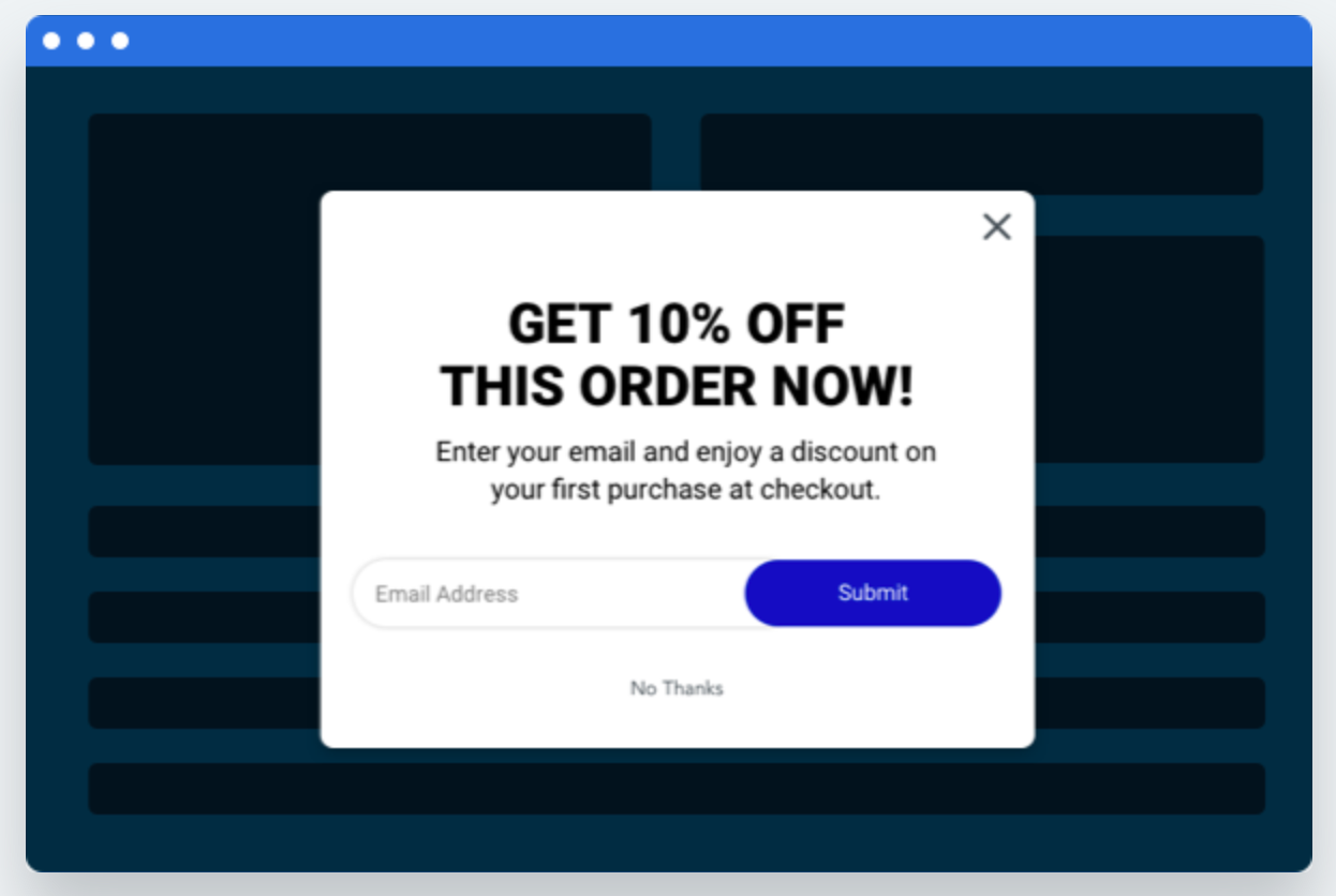
This will enable you to start getting people into your email funnel from your small business web design. If you don’t have a funnel, don’t worry. You can start creating a list and send it out when you’re ready.
Add Contact Forms
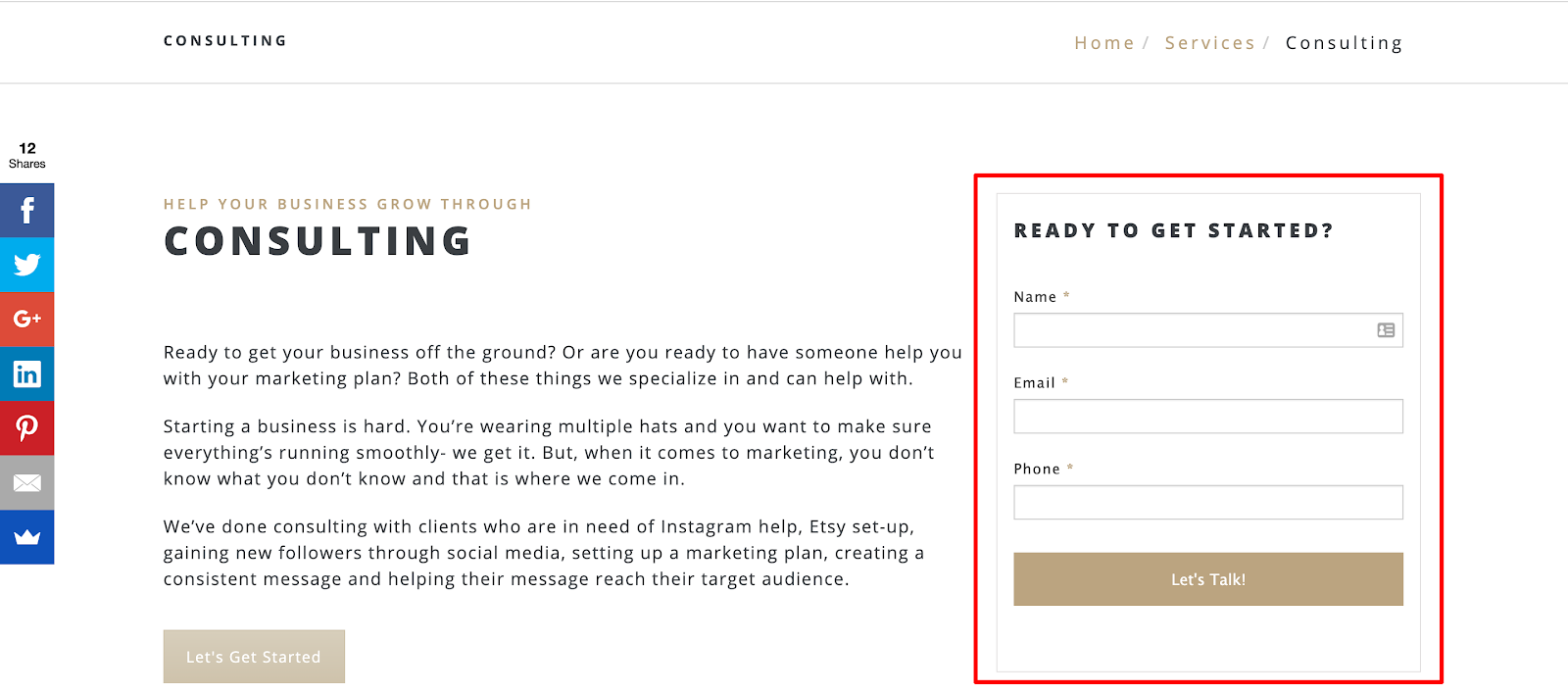
We experimented with contact forms on the sidebar of our website. We changed it from too many clicks to get anywhere to a solid form on the right side that only asked for three things:
- Name
- Phone
This isn’t too invasive and people are open to giving their information if it’s right in front of them and on each page. Why do we do this? Because people want the ease of access. They want it right in front of them and they want it to be easy.
Instead of having a contact form only on ‘Contact Us,’ we started adding it to each service page on the sidebar and we saw an increase in people filling it out. Test it for your site to see how it works!
Add Your Number
Your phone number is important on your small business web design because people sometimes want to pick up the phone and call. An ideal spot for it is on the header of your website (where the menu bar is) and even on a top header.
The significance of this is to follow the person around the website and to be there when they need it. Once again, making everything easy is ideal for having someone reach out to you.
Clean Design
This sounds silly and elementary, but I can’t tell you how many times I see a website and it’s like BOOM. I stop and think, “What the heck is going on here!?” I don’t even know where to start. And if I don’t know where to start when I do this for a living, customers who have no idea about websites are 100% completely lost.
Having a clean and easy-to-use website is key to helping convert customers. They’ll know where to go, what to look at and where they should get in touch with you.
Set Up Google Analytics
Google Analytics is the back end of your website, literally. It’s free and allows you to see where people are coming from, what they’re looking at, when they’re leaving and how long they’re staying… and many more items.
This is significant because you can see where people are dropping off and potentially why they’re doing it. You can change your page verbiage or add in an offer to see if you get people to convert.
All of these items will lead to a much cleaner and better small business web design. Having this is crucial to capturing and converting people from online. If you have any questions or want to chat about your website, fill out the form below and we’ll be in touch!
Get in touch
Schedule your complimentary call with us today!
