TABLE OF CONTENTS
Your logo is an important part of your brand. It’s typically one of the first features that people will see of your company, even before they know exactly what you offer. Here is a list of businesses that are killing it with their Orlando logo design.
Lineage Coffee Roasting
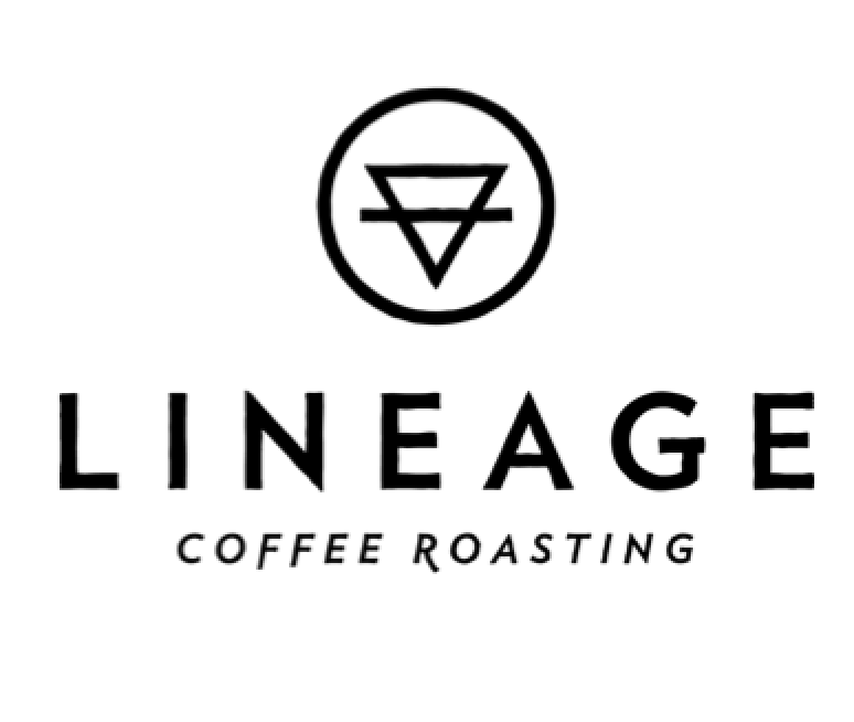
Lineage is the newest downtown coffee shop nestled on Colonial Drive and neighbors with Lazy Moon Pizza. This coffee shop is known for its simplicity and modernist design interior of stark white which is in contrast with their dark brewed coffee. A theme they established at their first location at East End Market. Their logo matches their clean aesthetic too.
Lineage is the perfect example of consistency with brand, as the logo fits perfectly into what they aspire to offer, which is a good atmosphere with even better coffee.
Naked Bar Soap Co.
Naked Bar Soap Co. is a unique shop situated in College Park. The name of the company is reflected on their product promise: that there are no unrecognizable ingredients in their soap. They don’t hide anything and this is represented also in their logo.
For their logo, the green represents natural and pure. The leaf is a nice little touch to add to this theme.
SOCO Restaurant – Southern Contemporary Cuisine
SOCO in Thornton Park on Summerlin Blvd. serves southern contemporary food, and their logo speaks it. Like with many restaurants and food companies, the color red has been shown to induce hunger. The red also is a warm color reminiscent of southern foods.
Logo is Your Brand
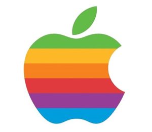
What do a green robot, red target, golden arches, checkmark and a half eaten apple have in common? No, they aren’t part of some epic fantasy, like Lord of the Rings or Game of Thrones. They are logos. They are Android, Target, McDonald’s, Nike and Apple.
These logos are world renowned. They have a lot of power. You see them, you understand them. You know what they offer. They’re simple and elegant.
There’s no reason why your Orlando logo design can’t achieve similar things.
What do you want your logo to say about you?
This is a very important question since your logo is your brand. Let me repeat that. Your logo is your brand.
It doesn’t mean once you pick a logo that it’s permanent. If you have a logo and you just aren’t feeling it, if you feel like it isn’t representing your company, or your brand, redesigning your logo is something you should consider (but after thinking it over for a long, long while… redesigns are comprehensive since you’re branding yourself from your logo design!).
For example, the world’s most popular and successful company Apple has changed the shading of their logo numerous times. They’ve gone from techno-color to black to white. Change is good, especially if it means more brand recognition.
Success doesn’t come from placidity; it comes from change, which is just another word for innovation.
If you’re considering developing your logo or changing your Orlando logo design, reach out to us here at South Street & Co. We can help.
Need help with your marketing? Let’s chat!
Get in touch
Schedule your complimentary call with us today!