TABLE OF CONTENTS
People always ask us what makes us different and I always say two things… #1: We’re creative
#2: I was on the other side of the table with marketing companies selling to me so it’s kind of like “been there, done that” and I know the over promises and under delivers.
But I want to play on #1, the creative aspect. We had a client come to us to see if we could help them work with a project submission for a prestigious construction award. We met with her and there was a TON of things to get right in regards to this project. We had an entire checklist- which is a little nerve-wracking considering I (we) didn’t want to forget anything that could disqualify them from the submission.
The Challenge
The client mentioned that they’d send us the information and we’d format it along with editing it for grammatical errors and other errors in aesthetics.
The Good Stuff
Then she got into the good stuff. They had the chance to submit the book creatively to win a marketing award. The marketing award was based on the most creative entry. She said that last year a company submitted the book in a globe. They cut out a hole in the globe, rolled up the entry book and stuck in in the opening. I thought it was pretty interesting, but maybe their tagline was something like, “Helping build to world one building at a time, ” or something cool like that. I could dig it.
But I wanted to think bigger, better, I wanted to WOW factor, ya know!? Here’s what we had. We had a construction company that had built a compounding pharmacy. They were going to be judged on all of the minor elements of that build. From the floors to the ceilings to the baseboards… all the minor details. So, what could we make that integrated the minor details but STILL was UBER/ SUPER/ AWESOMELY creative?
The Brainstorm
Then we brainstormed. We thought of some ideas:
- A skeleton wearing a white coat
- A skeleton holding the book in his hand
- A bucket that looked like a pill bottle
- A lookalike prescription form
- A pill bottle
We immediately nixed the skeleton holding a book/ white coat.
Side Note 1
We have this fake chalkboard joke to where if someone says/ comes up with a silly idea we put it on our invisible chalkboard to laugh at and remember later… this one went on that!! LOL
Side Note 2
We had less than 48 hours to pull this together because we didn’t have the “green light” from the client regarding this idea… sooo where do you get a skeleton in less than 48 hours. We debated going to a hospital and asking to borrow one but figured that wouldn’t be kosher 😀
Back to the Brainstorming
A bucket that looked like a pill bottle was an option. However, we thought we needed to get a bucket, paint it with resin (orange resin at that) and then cut out a lid using styrofoam… No. Then we were left with the lookalike prescription pad… This just wasn’t going to happen in the time we had left AND to get it printed was going to be like working like the Road Runner in the kid’s cartoons… No.
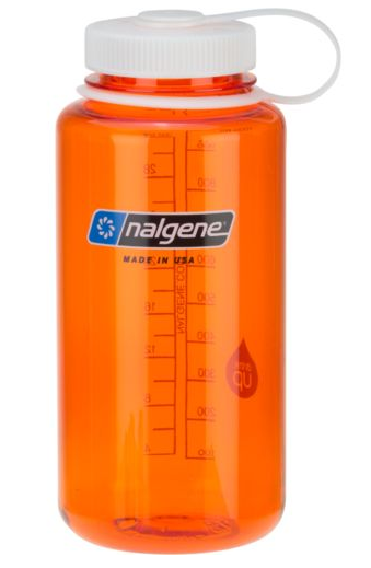
We were back to square one. We were talking this over with a bleak outcome, then Kate said, “Wait, what about a water bottle?” We looked at her for more explanation. She went on to mention a Nalgene water bottle that was wider and thicker than a normal plastic one.
We quickly Google’d it and found that Amazon Now didn’t deliver (bummer) and we couldn’t wait until Amazon Prime delivered (double bummer). So we looked at Dicks and found that they had one with an orange body and white lid – WIN. We called and had them put one on reserve for us so we could grab it quickly.
Alex ended up saving the day by bringing it the next morning to the office… it was at a location about 30-minutes away but Alex lived out that way.
The Label
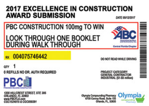
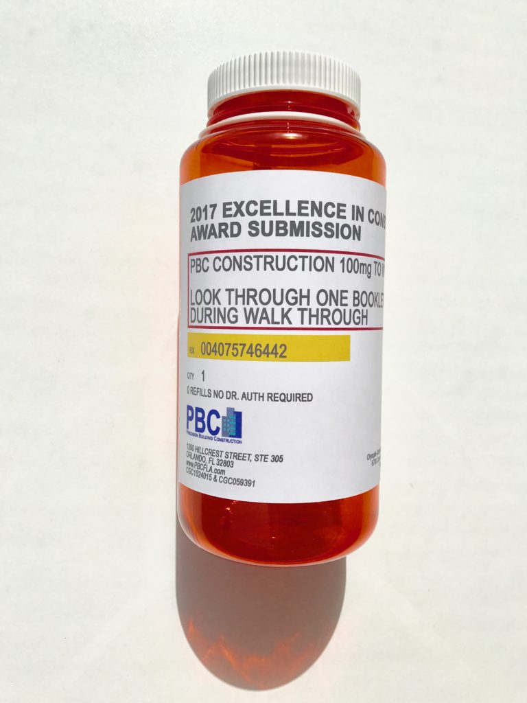
Then we needed to come up with the label idea, and I’ll tell you what, it all fell into place from there. We Google’d what a prescription bottle label looked like and created one identical to it. We added their logo on it and added the info about the event. If you glanced at it quickly you would have thought someone forgot their GIANT size pill bottle at our office. Here’s that the label looked like:
The Final Product
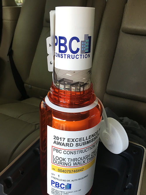
At the end of the day, the client was THRILLED. They thought it was a great idea and sent us a picture of the book rolled up in the top. We need to wait until the end of July to see if they won however, I know it will definitely be in the TOP contenders if it didn’t!!
Need help with your marketing? Let’s chat!
Get in touch
Schedule your complimentary call with us today!

