TABLE OF CONTENTS
If a new web design is on your mind, we have some good stuff for you to consider below.
The year is 2020, which means businesses are getting more and more creative with their web design and the strategies they’re utilizing to grab people’s attention. Us as consumers are only becoming more needy when it comes to a website we’re visiting and how quickly it can give us the information we’re searching for. That’s why it’s critical nowadays to conform to these new standards and provide a consumer experience that’s going to help you obtain more conversions, and, in turn, more loyal customers.
Here are five must-have features to implement in your new web design.
Interactive & Informative Visuals
In reality, you only have SECONDS to grab your viewer’s attention. This means you have to be strategic with what they see right away on the page they’re landing on. Including visuals always helps to break up information and make it more of a digestible read.
Including your own pictures (or even stock photos) that are relevant to your business is important for both educational and visual purposes. We also love the idea of including an infographic or icons that allow you to tell your story in unique forms.
Clickable CTAs
Having Calls-To-Action (CTAs) all over your web design is a #ProTip of ours. You want people to have every opportunity to convert or request more information. In saying that, we recommend having a CTA:
- On the top right corner of your website (usually a phone number or button)
- In the middle of the page (usually a form or button)
- In the footer (usually a phone number)
- Throughout the text within your content
Including all of these clickable CTAs will significantly increase your chances of getting engagement on your page. We also recommend adding UTM codes (more info on those here!) so that you’re able to track the number of clicks and view this data in Google Analytics.
WE CREATED THESE WORKSHEETS TO HELP YOU UTILIZE YOUR BLOG AND SOCIAL MEDIA BETTER. DOWNLOAD OUR FREE PRINTABLE SOCIAL MEDIA & BLOGGING WORKSHEETS BELOW:
Side-Bar Forms
Another CTA opportunity can come from side-bar forms. Let’s say you’re writing three blogs a month on fashion, beauty products and healthy eating. The people who jump at the opportunity to read your fashion blog may not be interested at all in your healthy eating one.
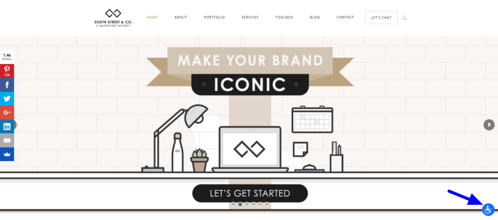
That’s why we recommend including automatic side-bar forms on every page of your website so that you can try to get conversions while you’re getting views. See the photo below for an example:
ADA Compliance
A HUGE priority of your new web design should be to make it all-inclusive for anyone stumbling upon it. This includes the Deaf-Blind community, and anyone else with a disability that may have a hard time exploring your website as is.
Implementing ADA compliance can not only get you more views (and respect!), but it can also help you avoid any trouble with the law. We recommend accessiBe and have utilized it for our own website and clients. See the photo below for an example of what it would look like on your website:
A Secure Web Browser
You may have noticed before that some websites say http:// while others say https://. You want yours to be in the https club! Having a secure URL will protect the integrity of your website and prevent intruders from hacking it. If it makes your potential customers and clients more comfortable, it’s worth it, right?!
If you found the information above useful, we encourage you to check out our Freebies page to find additional free resources that may teach you a thing or two about marketing or our best business practices! If you’re looking for a marketing agency to build your new web design and help you grow your business, click here to schedule a free consultation!
Get in touch
Schedule your complimentary call with us today!


